Thursday, January 20, 2011
blog entry #2.22- Human Ingenuity (E)
i think maybe some adults might be offended by my cards because i dont ave any for them also some elderly might be offended because they might think im putting them in a category that they do not want to be in and might be looking forward to something very dofferent. i just hope nothing will go wrong and all of my target consumers will enjy my cards.
blog entry #2.21 - greeting card 3 reject (B,D)

i think this design is less appealing because i dont wanna show these chindren another cartoon because they see stuff like this everyday. i want to wow them with something original and unique not the same old thing.
id make the picture different ang more bright. something more for the kids to look at. i dont want to bore them i want them to love my card and for it to be something theyll remember.
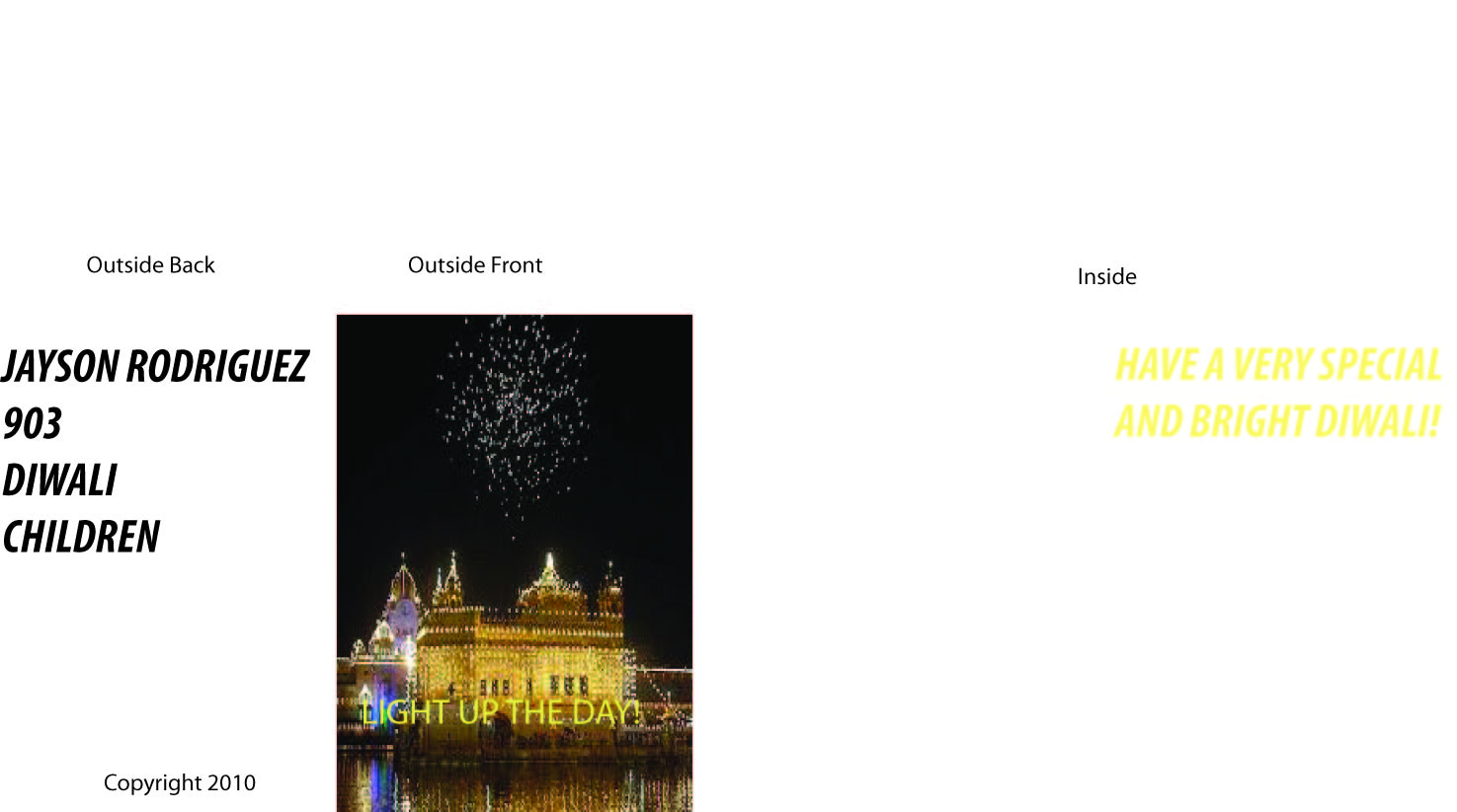
Blog Entry #2.20 - Greeting card 3 (B,D)

i think whats most appealing is the picture. its a castle with lights showering all over it. i think children would love it because they always think of castles and magic. it shoulg go perfect with there imagination.
the sketch was originally a dull building in light but this fits the consumers likes perfectly.
blog entry #2.19 - greeting card 2 reject (B,D)

this desighn is less appealing because i feel its not giving enough to wow my target consumers. i feel its not as good as the other.
this desighn could be improved by adding to the picture because its very dull.
Blog Entry #2.18 - Greeting card 2 (B,D)

i think the saying isappealing because its so simple and the picture mainly because itll wake them up.
th original sketch was bad in color and it didnt have a saying so i corrected each problem.
blog entry #2.17 - greeting card 1 reject (B,D)

i feel this design is less appealing thhan the other one because its way too much and you could hardly read the word on the cover.
the designs colors could be changed to make it better.
Blog Entry #2.16 - Greeting card 1 (B,D)

the consumer targeted by this card are teens. i chose teens because ima teen myself and i figured if i liked it mostlikely others will. also i thought it really poped out and looked realllllly good.
2. what elements of your card desighn are meant to appeal to this consumer? explain.
i think the picture comes out most to the consumer because its really big ant the first thing you see also its very cool to look at. also teens usually dont really see or celebrate this card or see these fireworks.
3.compare the final desighn with the original sketch . what changes were made and why?
the picture was kind of changed ans so was the consumer. what changed was the saying. i thought this saying would mean mre to my consumer than the other because its better and more simple.
Blog Entry #2.15 - Proxess journal 4 (E)
1. what has been completed so far for your greeting cards?
i have finished myy greeting cards with the picture, phrases and desighn.
2. what work still needs to be completed to finish all of your greeting cards?
nothing needs to be completed because i already completed everything needed to be done.
3. in what ways could your work be improved?
i could make the backgroung of each card colorful.
4. i think i really picked up my attitude in technology and ive stopped talking alot and began only focusing on my work.id give myself about an 80 percent. i can get started as soon as i walk in to improve my score.
Thursday, January 13, 2011


Thursday, January 6, 2011

Subscribe to:
Posts (Atom)